Wednesday, February 29, 2012
Tuesday, February 28, 2012
Not tonight
I have to cancel the video tonight because of a family obligation. Sorry for this, but something more important came up. I'll will have a video out for thursday. Thanks for understanding.
Monday, February 27, 2012
Monday's video
It seems that people are more responsive to these videos. I hope they help with your own analysis. If it seems a little fuzzy, click on the youtube button at the lower right of the video to enlarge the view. Once it brings you to youtube, click on the circle at the lower right of the video- change that to 720 HD.
Saturday, February 25, 2012
Weekend Video
Click on the youtube button at the lower right of the video to enlarge the view.This covers the Transports, Russell, SPX, NYSE and the Dollar.
Hope you like the video.
Thursday, February 23, 2012
Video
If the Audio is not working, double click on the video to bring up the youtube window. It should work that way.
Wednesday, February 22, 2012
The TELL ALL!
Is the S&P 500 Index or the New York Composite a better gauge of performance in the stock market? The S&P was carefully selected by a committee to represent the American Economy. On top of that, billions of dollars are invested by many money managers into mutual funds and pension funds that track the performance of the S&P. However, the short and intermediate term does not suggest for much of a correlation if you ask me. In fact, I am more inclined to say the NYSE, and here's why.
Except for the NYSE, the skewed performance in all of the indices is due to a high level of volatility. For example, the Dow Industrials has now broken its previous high, the S&P 500 and the other averages have sustained a grossly extended multi month rally, and the internals are screaming overbought plus diverging.
It all goes back to the Head and Shoulders Topping Pattern. As you can see in the chart below, the New York Composite is now approaching the neckline of the Head and Shoulders Topping pattern. Once the neckline of the pattern is broken, prices will rally back up on declining volume for a backtest. This rally is textbook, and better known as a Bear Market Rally. Depending on the drawn trendline, it may or may not be complete.
Take a look because it could be this Index that will complete the long awaited top in stocks for the S&P 500, Dow Jones, Nasdaq, and the Wilshire 500. The Russell and Transports still remain a sell signal.
The New York Composite Index

Several other charts to show you...
The U.S. Dollar- Daily Chart

The Russell Index- Daily Chart

Gold and Apple

Tuesday, February 21, 2012
Confirmed!
The Dow Jones Transportation Average - Weekly Chart
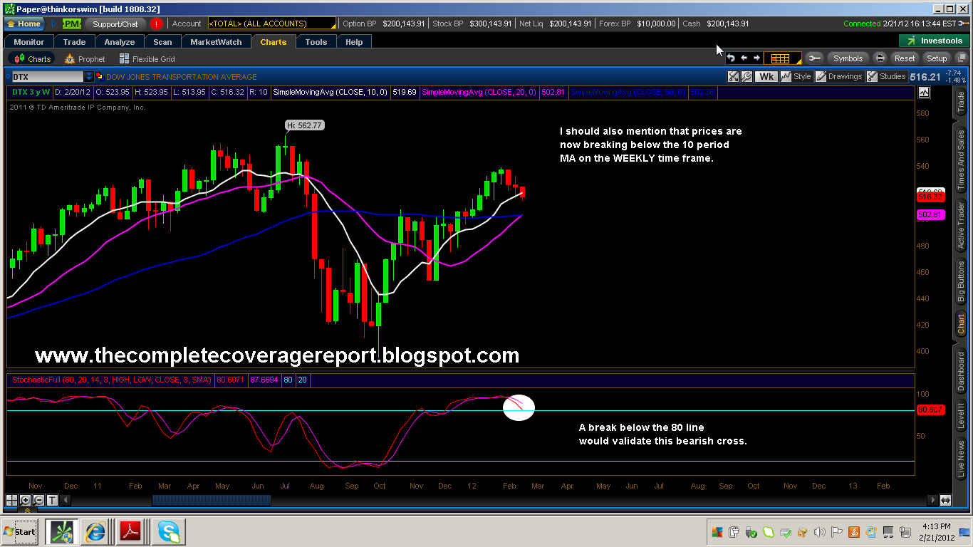
The Dow Transport Average is now revealing weakness in the weekly time frame. The selling pressure from today's session was enough for price to close below its 10 week MA. In addition, the bearish cross on the stochastic indicator reinforces this break down in price. Do keep in mind that the Transports usually lead the way for the rest of the market averages.
S&P 500 and Copper

When the two disagree in price, it is Copper that can usually predict the direction of the Market Averages. As you can see in the chart above, Copper has displayed a series of lower highs and lower lows, but the S&P 500 is revealing higher highs and higher lows. The divergence that has formed in their relationship is known as a "non-confirming" signal, suggesting that copper is not confirming the recent upside in the S&P 500.
The Russell Index- Daily Chart

Along with the Transports and Copper, the Russell too is not confirming the upside in the Dow or the S&P 500.
Sunday, February 19, 2012
Weekend Post
The Model

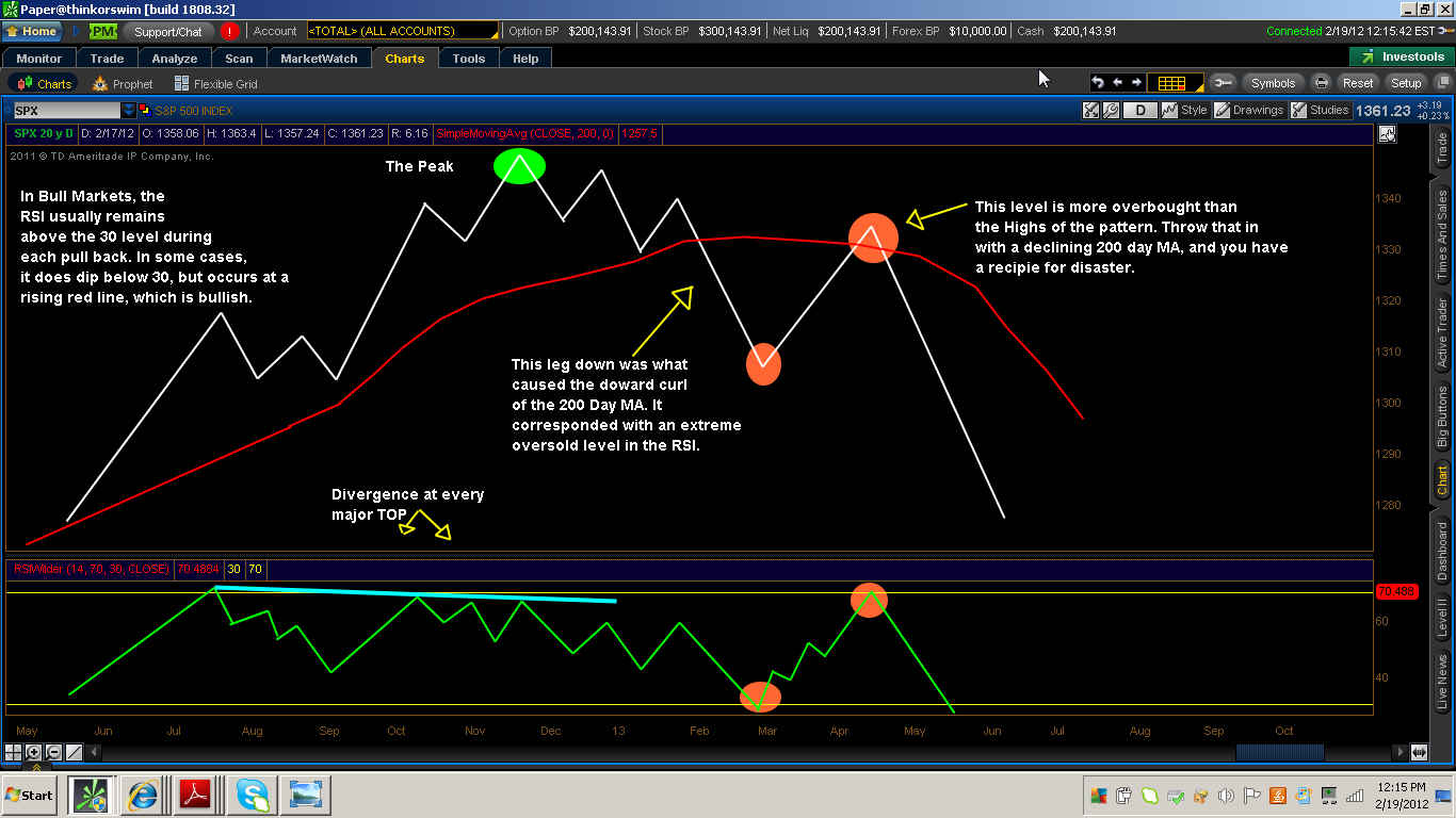
In my previous post, I explained how the slope of the 200 day moving average can properly identify a Bull or Bear Market. As you know, when the Red Line begins to slope downward, the Bear Market has begun. It is extremely important that you recognize this because your analysis is only half way complete.The other half requires that you identify the cause of this newly defined downward slope.
Prices that break below the 200 day MA will generally cause for the RSI to reach extremely oversold levels. The moving average will act as a magnet by following the direction of price. If prices sell-off enough to pull down a rising moving average, then the trend has changed direction.
2007-2009 Bear Market

In the chart above, I have illustrated the correlation between the S&P index and the RSI indicator. Now in order for you to fully understand their relationship, you must first recognize the discernably different characteristics of this indicator when in bull and bear markets. In a Bear Market, the RSI will serve the function of quantifying the degree of selling pressure. It is the extremity of these oversold conditions that accurately identifies each market bottom, unless a divergence has formed. Every bottom of the 2007- 2009 Bear market is colored with either a purple or blue circle. The purple circle corresponds with each time the RSI penetrates the 30 level. The Blue circle represents each time the RSI is contained above the 30 level. Here is another example.
The 2000-2003 Bear Market

This chart further reinforces the similarities that exist in Bear Markets.
2003-2007 Bull Market

Notice that each pull back is contained above the 30 level on the RSI indicator when prices are in a bull market. There are some cases where that level is slightly penetrated, but prices are quickly regained at the rising 200 Day MA. The RSI in Bull markets do not reach the extreme oversold levels that you see in Bear Markes.
Thursday, February 16, 2012
The Red Line
2007-2009 Bear Market

Today I am going to teach you about the importance of the 200 Day Moving Average. This particular moving average has several functions that are often overlooked by the amateur investor. One belief that many investors associate with is by using this moving average, one can determine a specific area of support or resistance. Other conventional wisdom suggests that by using the 200 day MA in conjunction with the 50 Day MA, a bull or bear market can be defined. A "golden cross" is when the 50 Day MA crosses above the 200 Day, signaling the birth of a new uptrend. Conversely, A "Death Cross" is when the 50 Day MA crosses below the 200 Day MA, which supports the notion that prices are in a downtrend.
So what's so important that we all seem to not understand? It is the SLOPE of the 200 Day Moving average that has greater meaning. Let me explain.
As you can see in the chart above, I have used the previous Bear Market of 2007-2009 to illustrate my point. Notice the slope of the red line(200 day MA) begins to flatten out at the peak of 2007. Following this flattening out period, that same red line began a downward slope. Anytime that prices rallied back up to a downward sloping 200 day MA, resistance was met by sellers of the market. The point is, when that line rolls over to one that is declining, technical damage has been done in the marketplace. Here is another example.
Bear Market of 2000-2003

It might also be important to mention that evidence of a declining slope only suggests that the we are in the beginning phase of a Bear Market. Following this phase, the 200 day moving average will go from having a declining slope to one that has falling slope. At this point, prices become extremely stretched from their moving average, and decline at an unsustainable angle. In other words, prices go into free-fall mode.
Bear Market of 2007-2009

Once the red line begins to curl upward, the Bear Market is over. It is here that prices are extremely oversold and due for a reversal.
The Bear Market of 2011-

The declining slope of the 200 day moving average is very bearish. The July sell-off did enough technical damage to allow for a multi-month snapback rally. We cannot compare this sell-off to the one in May of 2010 because the red line flattened out. A declining slope cannot automatically reverse and begin to rise. The sequence of events must fall in the order in which I explained them.
Wednesday, February 15, 2012
Uh-Oh!
The Dow Industrials- Hourly Chart

I have simplified the reversal process into three easy steps. Now before I go in to explaining exactly how to identify a reversal, one must have the ability to recognize early warning clues that lead up to such an event. Some examples include- Stocks above their 50 day MA in overbought territory, Divergence in momentum and swing indicators, exhaustion in the current trend, and Topping price patterns. There are many others, but these set of examples should lead you in the right direction.
To simplify matters even more, I will use The Dow Industrials. In the chart above, I have drawn a rising wedge pattern to outline the containment of price. A break out of this particular pattern does not necessarily suggest the trend is broken, but do take heed to the lengthy duration of this current uptrend. Following the "Break" , the next step is a backtest of the same trendline. During the backtest phase, prices rally back up to the broken trendline where they now find resistance. This same level will produce a lower high and a fairly good entry point for a short postion. Finally, the resumption of the trend gives meaning to the newly defined downtrend. It clarifies the price structure by revealing a series of lower highs and lower lows.
The Russell- Daily Chart

The Russell produced its own reversal around the same time as the Dow Transportation Average. The trendline break in the daily time frame is confirming the reversal that transpired on the Hourly chart. The Basic idea is that price is conveying weakness that can be seen in a higher time frame. I should also mention that the higher time frame dictates the direction of the trend.
The U.S. Dollar- Weekly Chart

The Dollar is now showing strength on the weekly chart. This certainly will generate selling pressure in the equities markets.
The VIX- 4 Hour Chart

The VIX is now confirming several sell signals for the Market Averages.Folks, If it's not clear to you, then let me say it like this- WE NOW HAVE A REVERSAL IN ALL MARKETS!
Good Luck with your Trading,
Darah
Tuesday, February 14, 2012
A few things
Gold- Daily Chart

Those that don't believe gold will ever come down are improperly evaluating the metal's downside risk. Gold is not exempt from a larger corrective decline, especially after an eleven year run. I do foresee Gold to head higher when I review the metal's long-term outlook, but the chart suggests for continued weakness in the short and intermediate term. Gold cannot be on the verge of a bubble phase with the U.S. Dollar in a strong bull market, nor does it seem logical to think the two would move in lockstep of one another. Furthermore, once the stock market is ready to enter its own multi-month decline, it will almost certainly spill over to all other asset classes in the marketplace.
Silver- Daily Chart

Silver appears to have been coiling for several trading sessions. This coiling pattern is revealing in the form of a narrow trading rage that often lead to large directional moves. The physcology behind this trading range is a result of indecision and growing frustration among investors who are anticipating news that is specific to a particular outcome. Given the overall bearish price structure, the odds are favorable to a downward move.
The U.S. Dollar- 4 Hour Chart

The Dollar appears to be forming a rounding bottom on the 4 hour chart. The period in time by which this pattern carves out will provide more validity in defining the area of support. In other words, the longer this pattern bases, the stronger that support area will hold.
The S&P Mini- 4 Hour Chart

This is under the assumption that the pattern is half way under construction. The slow grinding type of sell-off that precede this particular pattern can take several trading sessions.
Monday, February 13, 2012
We're getting close, very close!
The Dow Transports- Daily Chart

The Transports may be leading the way for what could soon transpire in the other asset classes (SPX, Gold, Silver, etc). Today marks the fourth sessions that prices have closed below the 10 period moving average in the daily time frame. In addition, prices have broken the intermediate trendline dating back to the October lows. The weakness in the Transports could spill over to the Dow Industrials, which could then force liquidation in the metals.This type of domino effect may very well be in it's pre-mature stages.
The U.S. Dollar- Daily Chart

The Dollar has also closed above its 10 day MA along with breaking the declining trendline. Furthermore, the Stochastic indicator has revealed the signal line breaking out from oversold levels.
The VIX- Daily Chart

The VIX is a measurement of fear and volitility in the marketplace, but also a contrarian indicator to the overall market averages. The inverse relationship that exists between the VIX and the market averages can confirm certain price action by corresponding signals in both indices. For example, the reversal that has transpired in the VIX, in theory, should confirm a reversal in the market averages (SPX, DOW, Nasdaq, etc.). At this point I see no evidence of a reversal in the Market, but the reversal in the Dollar, the Vix, and the transports could be clueing us in to something much larger forthcoming. Until then, we must classify these signals as "non-confiming."
The S&P Mini- Hourly Chart

As I have mentioned in the chart above, it appears that prices are in backtest mode. There is the possibility that we may backtest as high as the apex of the current wedge in place, but you're putting yourself at high risk if you're long this market.
The S&P 500 Cash Index- Hourly Chart

I am seeing signs of trend exhaustion, plus we are currently trading at the apex of the rising wedge formation. At this point, a reversal is imminent.
Saturday, February 11, 2012
The Weekend Report
Dow Theory
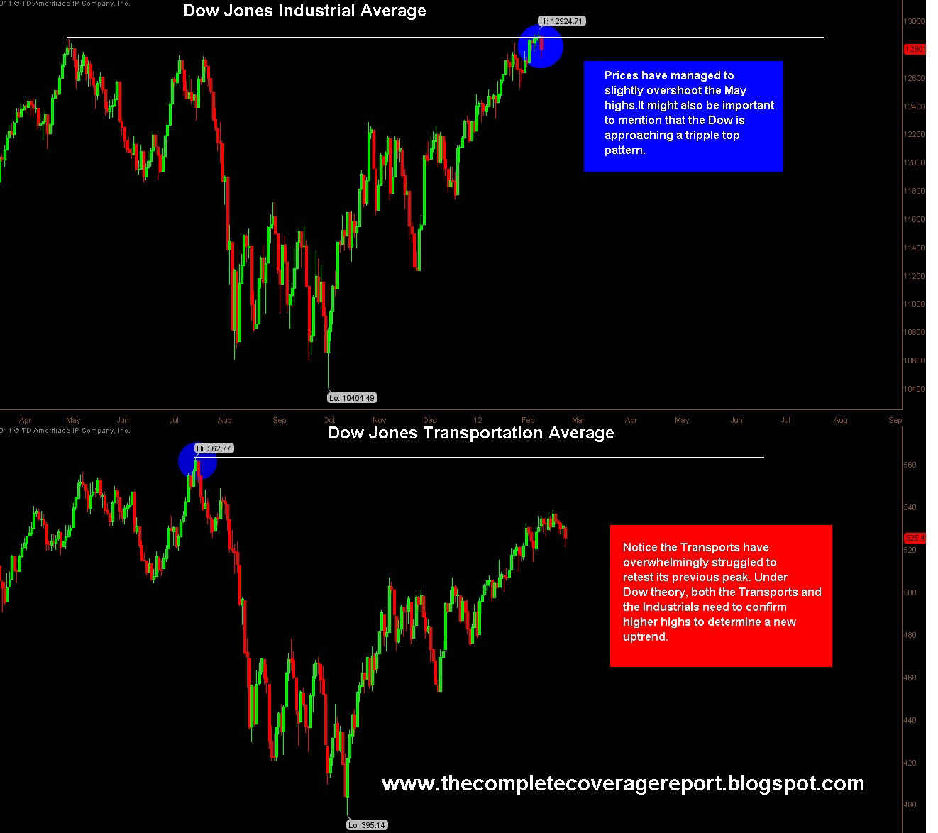
One of the basic concepts of Dow theory is the "principle of confirmation". To put it simply, one average must confirm the other average to validate the trend. As of right now, the Dow Jones Industrial Average has produced a higher high, signaling the birth of a new uptrend. However, it remains to be seen whether The Dow Transports can regain the previous high made in July. Unless the Transports can also produce a higher high, we must remain suspect to the new highs in the Industrials Average. It might also be important to mention that the Dow Industrials is now approaching a tripple top, which is a pattern known for its powerful resistance levels.
The U.S. Dollar - Daily Chart

If this is indeed the turning point for the dollar, several things should have occurred that did not. First, when prices resume in the direction of the trend after a retracement, especially after an intermediate cycle low, the expectation is for an explosive move. Friday's session had the chance for that scenario, but the early morning strength faded into the close. Second, The Dollar should contend with its drawn trendline to justify the angle at which prices ascend.
The U.S. Dollar- Daily Chart

Under this scenario, the assumption is that stocks produce a reversal as early as Monday. That would almost guarantee a surge in the dollar, probably powerful enough to breakthrough the previous cluster zone in one session.
The S&P 500- Hourly Chart

There is very little wiggle room left to complete the Rising Wedge Pattern. Look for a violent break of the lower trendline to validate the pattern. That will signal a reversal on the hourly chart, but spill over to the daily time frame as well.
The S&P 500- Daily Chart

Friday's close found support at the 10 Day moving average. I have highlighted the wick of the candlestick to represent the buying pressure of the trading session. It is important for you to know that we must close below the 10 Day Ma for a reversal to occur.
Thursday, February 9, 2012
The Internals
Stocks above their 50 day MA

Readings of 75% and above call for a top in the market. This called for a short-term peak in November as you can see in the chart above. Now that we are at these elevated levels again, the expectation is that a top is due. In addition, the overall structure of this indicator can be classified as a double top (with the right peak slightly higher than the left peak). The double top pattern that you see is not in agreement with the pattern of the overall market averages. This is a result of divergence that forms, and more often than not, suggests that a larger top is in place.When the market moves higher, but price in relation to its moving average remains relatively the same- watch out!
The SPX- Daily Chart

The S&P 500- Hourly Chart

In order for a reversal to transpire, prices must decisively break the lower trendline and develop a series of lower highs and lower lows. This should correspond with a confirming close below the 10 period moving average on the daily time frame. I also want to mention that there was a relatively high "selling on strength" number for the SPY. This number represents the money flow out of a particular stock. The SPY is a proxy that mirrors the performance of the SPX cash index.
The QQQs- Daily Chart

We all know how parabolic moves end.
Wednesday, February 8, 2012
Look at this!
The S&P 500- Daily Chart

Prices should soon enter what I call the rubber band effect. Under this theory, when prices trade farther away from their typical orderly movement, a snap-back to the trading norm will occur in a similar, or greater fashion. In the recent weeks, traders have become impatient and overly frustrated with the unusual longevity of this contra-trend. To put things in perpective, I have used the RSI indicator in the chart above to corroborate the idea that something has to give. Dating back to the May highs, this particular indicator does a fine job at accurately timing each directional move. Look at the chart above to see that prices will soon regress to their mean, but do so in a violent snap back sell-off.
The S&P 500- Daily Chart

Massive resistance lies ahead for stocks, as you can clearly see in the chart above.
The U.S. Dollar- Weekly Chart

The Dollar still remains in a corrective decline. I have used the MACD indicator on the weekly chart to better evaluate the intermediate price movement. The bearish cross does overpower signals given on the daily chart, so look for more downside. My best guess is that we further correct to the weekly trendline, establish a higher low, and resume the dollar's bull market.
The VIX- Daily Chart

This signal is somewhat pre-mature, but do take heed to the break of the declining trendline. This particular trendline reflects the short-term movement in price, so keep that in mind. It also may be the beginning of a much larger move coming.
I hope you guys like the new look,
Darah
Tuesday, February 7, 2012
Take a look
The Dow Industrials- Daily Chart

You could even argue that the chart pattern above is a tripple top. Tripple Tops are known for their massive resistance.
The U.S. Dollar- Daily Chart

Usually in a deeper retracement, prices experience large downside moves toward the lower end of the decline. This is under the assumption that we have a one to two day waterfall decline event.
The S&P 500- Daily Chart

If prices remain in their continued uptrend, then it can be expected that further consolidation will persist in the next few sessions. Under this scenario the 10 Day moving average would have a chance to catch up with price. It would be at this point that we experience one last surge in stocks to complete this grossly extended multi-month rally. However, I should also mention that if stocks are to quickly reverse from here, it would almost certainly produce a powerful move in the U.S. dollar. That scenario would assume that today's sell-off in the dollar was a bear trap. See the chart below to have a better understanding.
The U.S. Dollar- Daily Chart

S&P Hourly Chart- Wave count

It's almost over folks.
Saturday, February 4, 2012
This may be it
S&P 500- Daily Chart

The U.S. Dollar index

The Nasdaq Composite- Weekly Chart

S&P- Hourly Chart (Wave Count)

S&P-4 hour chart

S&P Daily Chart

Subscribe to:
Posts (Atom)